Because the house started its life as a gas station, only the sink and toilet were originally present. At some point, one of the owners added a garage on the other side of the bathroom, and then used some of that space to add a tub and shower. The bathroom was teeny tiny, and everything that was crammed in there was extremely dated.
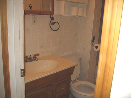
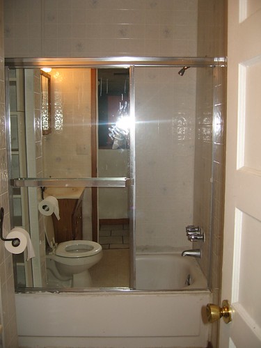
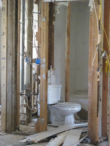
We ripped everything out and tore down all of the walls.
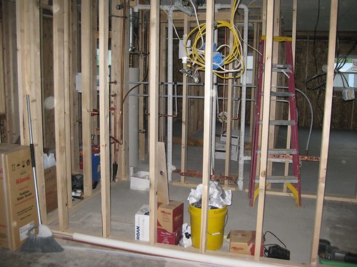
The new bathroom was widened to hold a 5.5-foot long tub (which is so awesome!) and extended to include a large vanity and a 15" linen closet. The door was also moved around the corner so that it isn't visible from the kitchen.
The tub surround is slate tile in grays, greens, and tans, and we put in light maple cabinets.
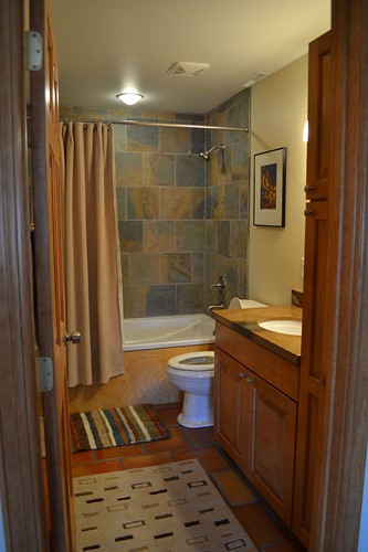
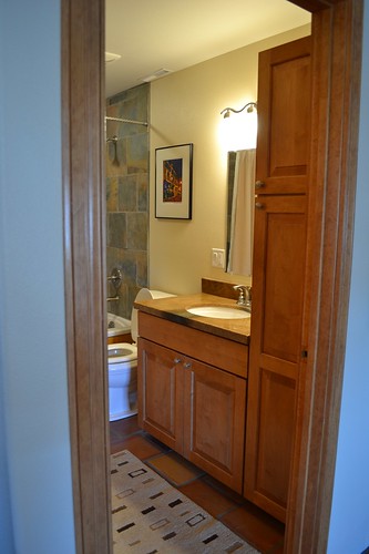
The countertop is a product called granicrete. They use a trowel to spread a thin layer of concrete over wood. For my countertop, they added some texture to make it look similar to the slate, and then used a variety of colored stains to match the colors found in the slate tile. The countertop was then covered with an epoxy so that it is smooth to the touch but allows you to see the texture underneath.
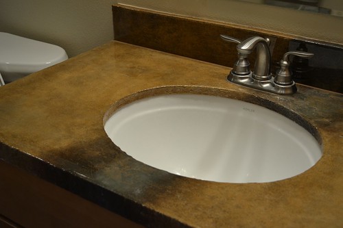


WHAT a huge diff! I love that concrete countertop. The whole bathroom is so full of texture! Love it!
ReplyDeleteBeautiful! Especially love the cabinetry - such pretty wood.
ReplyDelete