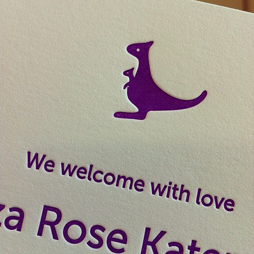
I recently printed these announcements in a dark purple color for little Eliza Rose. I think the baby kangaroo in its momma's pouch is absolutely adorable. Eliza got coordinating note cards printed in the same shade of purple but with a platypus. Too cute!
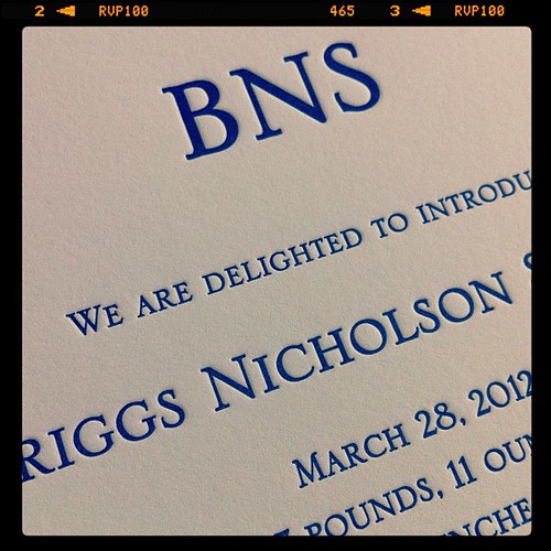
Here are some announcements I did for Briggs. It was a very simple card with his initials and details printed in a dark blue.
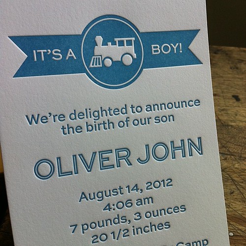
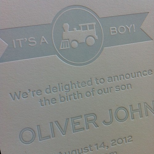
I am also finally working on some new (and more fun!) designs for birth announcements and invitations for kid's birthday parties. The first is this train design; I printed the birth announcement sample in this fun medium dark blue and also in a pale blue. I think I like the darker blue better. Next I plan to print the coordinating invitation in a bright grass green color. Now if only I could find the time to take some proper photographs so I can list it in the shop! ;)
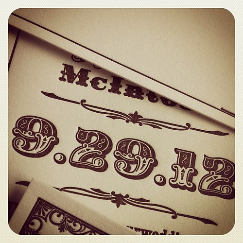
And last but not least, here are some save the dates that I don't think I ever shared with you. I am working with the daughter of some of the husband's friends to design the invitations for her wedding in Moab, Utah in September. She wanted a vintage western vibe, so we picked this beautiful font that has an old-time Western feel but with a touch of glamour. It's actually a revival of a font designed in France sometime around 1820. We combined it with some other more serious western fonts as well as some pretty borders and decorative elements. I printed the save the dates a while back, and now we're working on finalizing the design for the invitation and other pieces. Everything is printed in a rich dark brown on ivory cotton paper, and the invitation will feature a few bits of teal as an accent color. I can't wait to show you the rest of the pieces!


All are just great, Melissa. I especially love the letters you used for Oliver John, and the vintage Western font is perfect too. I would love to watch you work to see exactly how the type winds up on the card!
ReplyDeleteWow! These look seriously amazing.
ReplyDelete