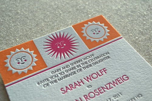
Sarah already had a very clear idea of the general layout she wanted for the invitations, and she very specifically wanted some Alexander Girard-style smiling suns. She found images she liked online and cut and pasted them together along with sample text in a font she liked. I took her initial idea, tweaked it a tiny bit, created two different suns, added some color, and presto! We also designed a double-sided reply postcard.
This invitation set was a lot of fun to print, but it was also quite challenging, given the need for each color to be perfectly registered with the others, especially in the orange suns.
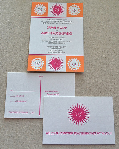
The invitation is printed in three colors, and we wanted the orange and pink colors to be as solid as possible, so I printed the orange three times and the pink twice to get a nice solid coverage of the ink. Then I did a sixth run through the press using a dark chocolate ink for the text. The invitation and reply card were both printed on extra thick 220 lb paper.

I finished printing them over the weekend and yesterday I packed everything up and sent them on their way to New York City. That's one more project cleared out of the nest. Yay!


Oh how perfect - you did a great job! Isn't it nice when a client knows what they want? Makes things so much easier.
ReplyDelete